前言
Butterfly主题并不适配宽屏。我使用的宽屏电脑进入我的博客,左右两边会有很大的空白,感觉太紧凑了。于是我就适配了一下宽屏。
挺好适配的,适配之后就饱满了许多。
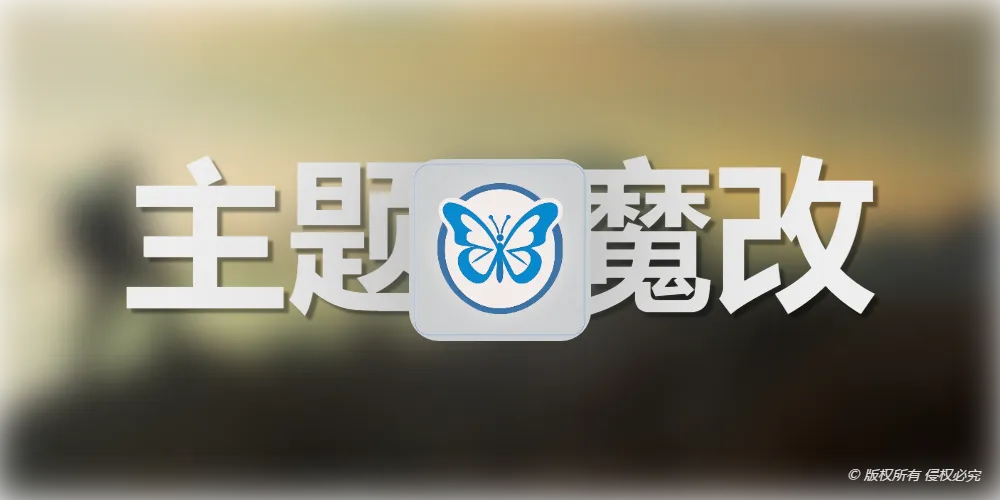
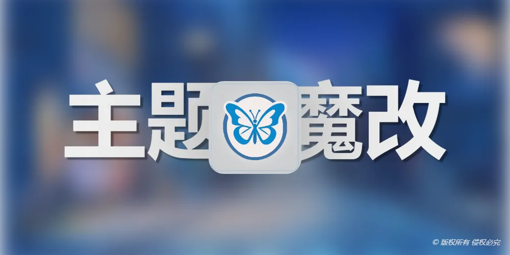
效果预览
所见即所得,可以去Butterfly官方看我的博客与它的区别。
教程
本教程不会涉及到主题文件的修改,所以无需备份,有错误或改动不可观删掉css即可。
1.自定义css
在 [根目录]\source\css\custom.css 文件下方添加以下代码(没有就新建):
1
2
3
4
5
6
7
8
9
10
11
12
13
14
15
16
17
18
19
20
21
22
23
24
25
26
27
28
29
30
31
32
33
34
35
36
37
38
39
40
|
.layout{
width: 100%;
max-width:1400px;
}
.layout > div:first-child {
width: 100%;
}
#post {
width: 78%;
}
.aside-content {
max-width: 312px;
min-width: 300px;
}
.layout.hide-aside {
max-width: 1400px;
}
#recent-posts > .recent-post-item {
height: 19em;
border: var(--style-border);
}
#recent-posts > .recent-post-item >.recent-post-info {
padding: 0 56px;
width: 64%;
}
@media screen and (max-width: 768px) {
#recent-posts > .recent-post-item {
height: auto;
}
#recent-posts > .recent-post-item >.recent-post-info {
padding: 20px 20px 30px;
width: 100%;
text-align: center;
}
}
|
2.引入css
在 _config.butterfly.yml 的 inject 部分添加:
1
2
3
| inject:
head:
- <link rel="stylesheet" href="/css/custom.css">
|
引入过了就不用了。
3.hexo三连击
1
2
3
| hexo clean
hexo generate
hexo server
|
去 http://localhost:4000/ 看效果。
结语
一样,又简单又实用!

 微信
微信 支付宝
支付宝